Styled vs. Collected
How to design a considered space, without it looking like a catalogue
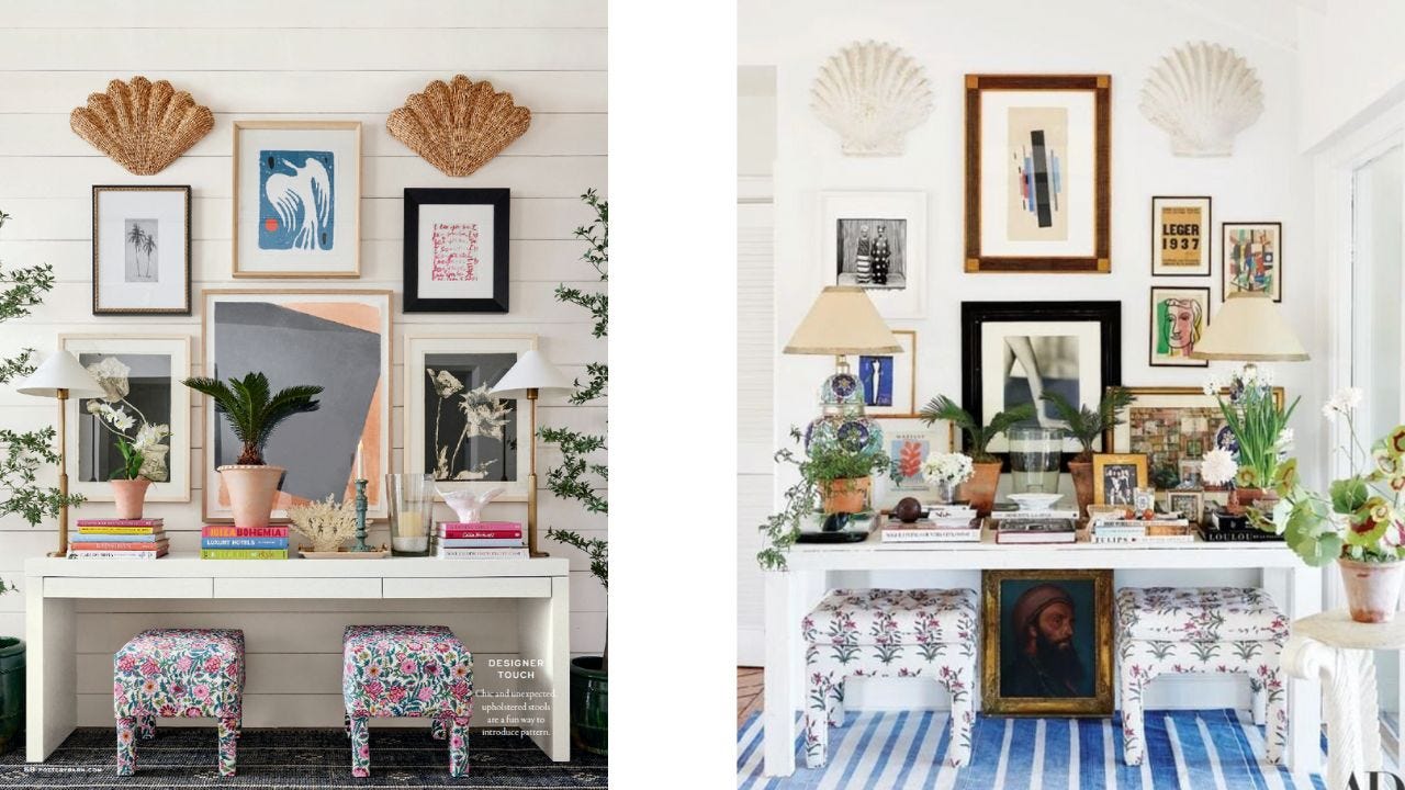
There is such a big difference between layering pieces you’ve accumulated over decades and styling a bunch of new pieces that all came from the same store. And I think the images above — strikingly similar but altogether different — offer the perfect example.
I was looking at the latest Pottery Barn catalogue and a lightbulb immediately went off in my head when I saw this image:
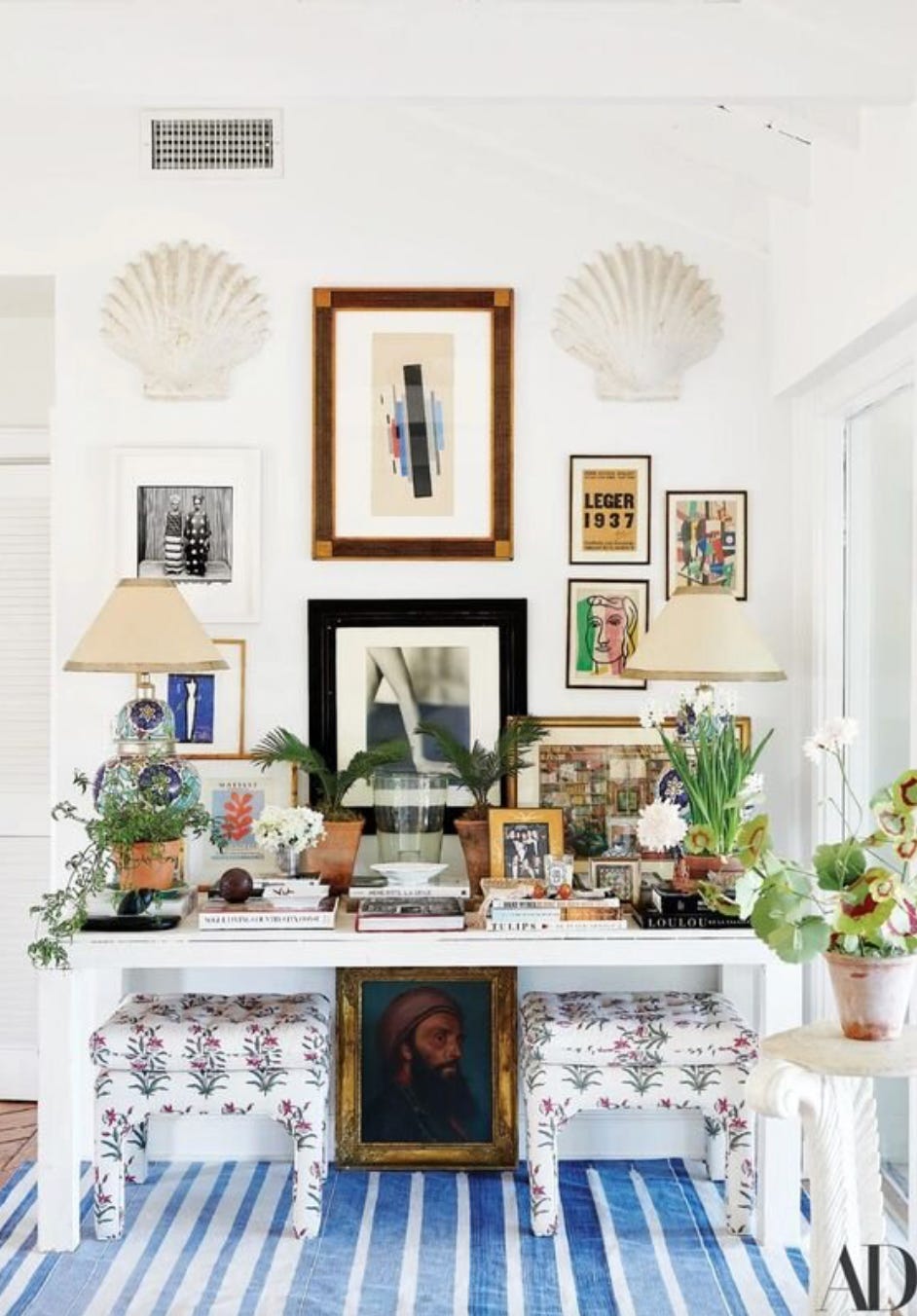
And that’s because it conjured an image that has been burned in my brain and saved in my Pinterest folders for years — this one from jewelry designer Rebecca de Ravenel’s home:
From the matching shell sconces flanking the gallery walls to the pair of ottomans beneath each stark white console table, it is quite clear the styling team at PB was inspired by the above vignette.
Look, I get it: For catalogue styling, the point is to create an image that people can shop, right? So no one is actually living in the Pottery Barn-styled space. But it still demonstrates that having all of your items from the same time period (and, in this case, the same store), makes everything feel a bit sterile.
Here’s why Rebecca de Ravenel’s vignette feels so much more livable and considered than the Pottery Barn catalogue:
One is the use of the space itself. There are really no empty areas here, your eye constantly has a place to go. Even under the table, there’s an antique portrait in between the ottomans so it completely fills the space.
Also, there’s symmetry in both spaces — there are two matching lamps on either side of the console, two shell sconces above and two ottomans beneath. But in the Architectural Digest image, there are elements that keep things slightly off balance. There’s an odd number of paintings beneath the right shell sconce, for instance. (And btw, I love a shell motif. I wrote all about them here.)
The space doesn’t take itself too seriously. The plants placed in front of the lamps are similar, but in different heights. Also the frames are different on the artwork. Some are dark, some are lighter. The art itself is a mix of photography, abstract, and traditional (like the oil portrait beneath). There are also interesting little trinkets and dishes placed on top of the books in this image which just add another layer. The point is: adding to a space over time and not being so tied to symmetry and balance can actually make a space feel much more considered!
Rapid Fire
Cheers: I was recently sent a box of amazing non-alcoholic beverages from Bardelia. Ghia’s lime & salt spritz is so far my favorite (I poured it over big block ice in a glass rimmed with tajín; it couldn’t have been easier). They’ve generously offered a discount code for 15% off anything on the site (VCHAMLEE15).
A recent purchase: This dress is flawless. It’s not the kind of thing I would normally buy, but I took a chance on the silver version and am so glad I did. Now, it’s available in pink which is actually more wearable than the silver (which veers more nighttime, while this version could easily go day). There’s also a top version and the cut is so, so flattering (it’s a nice open-weave so it isn’t too heavy for summer and it looks swingy, rather than heavy, when it’s worn). It has a similar vibe to this Stella McCartney, at a much more reasonable price point.
A book I’m reading: I know I’m the last person to read Matt Haig’s The Midnight Library, but gosh I’m glad I finally picked it up. He writes women very well and the story is so fresh and inventive.
And I’ll leave you with this…


This one is SOOO good. It's all about that portrait under the console....peering out:)