

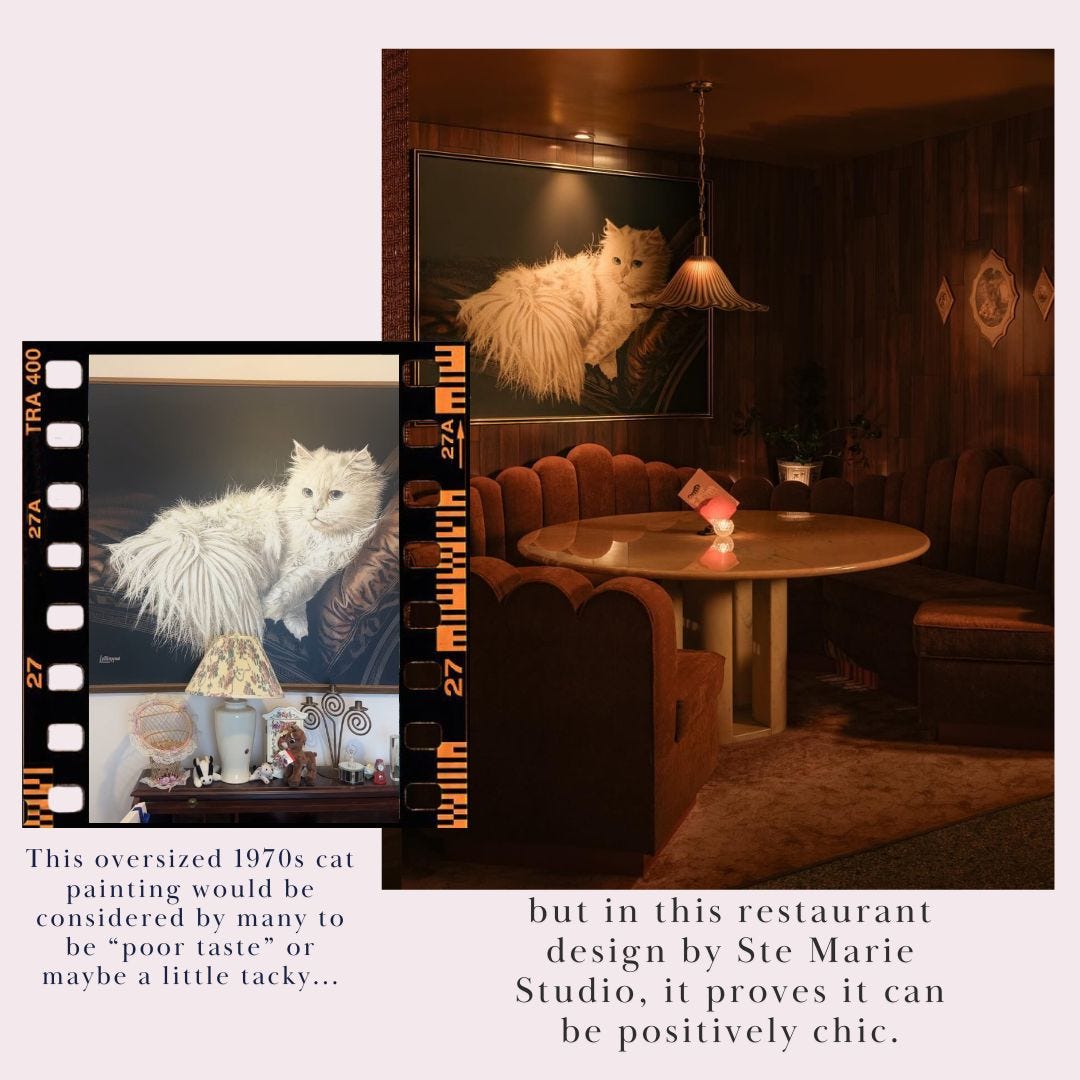
All Hail the Slightly Tacky
Who gets to decide what "good taste" is, anyway?

Years ago, there was an Instagram account that was dedicated almost entirely to making fun of architectural choices. For a long time, it was really funny and it felt very harmless! There would be photos of a staircase leading up into a wall, or a sink built inexplicably over a toilet… lots of silly, “Why on Earth did they do that?” moments. But as the account grew, some of its posts became less funny and more, well, cruel.
I remember one post, in particular, which showed real estate listing photos of a home that included someone’s collection of Minnie Mouse memorabilia. I can’t remember what the caption read but the implication was clear: “Let’s make fun of this home because it’s full of what we consider to be cheap and tacky. Those of us who hate it are the ones with good taste.”
It hurt me to look at that post because I knew that someone had spent years — a lifetime — collecting that Minnie Mouse stuff. They had probably delighted in every trip to Disney World, every opportunity to find a little something special to add to their collection. Each figurine came with a story. Some, no doubt, were gifts from others who loved the homeowner.
I have never been a fan of “in” and “out” lists, especially when it comes to interior design. I believe we should all design our homes how we like. Yes, there are styling tips and tricks to make everything look more cohesive, and trends that make things look more current (if you want!) … but saying something is “in” versus “out” is declaring that you are the one who gets to determine what falls into the category of “good taste.”
Good taste is highly overrated, IMO — and often, what we consider “good taste” is really just a signal for “wealth.”
I think that a little bit of bad taste – a dose of tacky, a wink at obscene, a nod to maybe-a-little-bit vulgar – is kind of nice.
This bit, from Grace Atwood’s recent letter about the joy of a good guilty pleasure watch, really spoke to me:
There’s an art to appreciating the lowbrow. It’s about leaning into what makes you happy, rather than what’s trendy or what you should like. It’s about embracing fun without guilt. It’s about giving yourself permission to enjoy things just because they bring you joy, no justification required.
A rich cultural life combines high and lowbrow content. Often, the low can speak to the high.
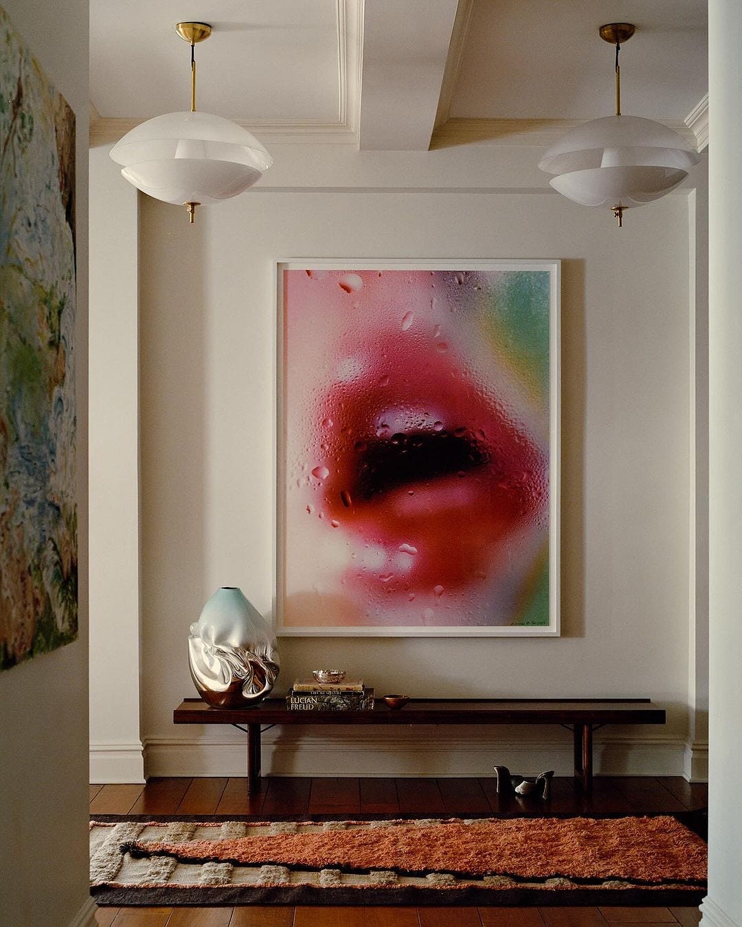
This is why The Wrong Art Theory (which I wrote about way back in 2023) works. The concept is one of juxtaposition — of picking a piece of art that adds tension, rather than balance to a space.

Interior designer Sandra Weingort nails the Wrong Art Theory. Her Instagram is a veritable rabbit hole on interesting ways to style and showcase art. She has this way of juxtaposing very classic pieces of furniture with contemporary paintings, photos and sculptures. It’s about diversity — kind of like organizing the guest list at a dinner party. You always want some oddballs thrown in there, to keep things interesting.
Even though the art in these spaces is unexpected, it doesn’t steal all the thunder. Instead, it plays off of everything else in the space. The really incredible folk art piece above, for instance, works in conversation with the textile covering the headboard — and with the rug underneath it all. The other textures in the room (the stone side table, the wooden stool) don’t fade into the background at all, but live harmoniously with everything else. In other words, everything feels considered.

This space above is another excellent example of The Wrong Art Theory in practice. If you saw a painting like this in a gallery, would you think of it as a statement, or as something simple? In this space, it’s spectacular. I adore the bright, saturated colors and the clean lines which counterbalance the more abstract nature of the dining table in front (and don’t me started on how it looks like the flowers in the painting are sprouting up from the vases on the table…the whimsy!)
For decades, interior design was about symmetry and matching everything (remember when we would go in a furniture store and buy the full bedroom set?) But these days, cohesion has given way to a little chaos. And I think we’re all better for it. Imperfections make a space feel more alive.
If we only focus on good taste, we risk losing the diversity of varying points of view — the richness of surprise and whimsy — and consign ourselves to an ocean of beige.
One thing I love about thrifting, estate sale-ing, and antiquing is that you’re often buying the rejects. It’s one of the reasons I titled my newsletter What’s Left — because often, the stuff I’m buying is the stuff that’s left over from someone’s old life. Maybe they died and their family took what they wanted, and gave what’s left to an estate sale company. Maybe they moved, starting fresh with a clean slate and giving their leftovers to the local Goodwill.
Often the art we come across at thrift stores is, simply put, kind of weird. It’s stuff no one else wanted and most people don’t know what to do with it. But as the spaces here demonstrate, the weird stuff — the “wrong” stuff — can still be so beautiful when styled in a thoughtful way.
If you enjoyed this letter, please “heart” it, share it, and consider subscribing. Your support means the world to me.
A recipe I’m into at the moment: Caro Chambers’ Chicken Schnitzel topped with Caesar salad. This is a great example of tension in a recipe, rather than a room. There’s warm contrasted with cool, crunchy chicken contrasted with creamy dressing. It’s a salty, delicious dream of a recipe and I made it as soon as it hit my inbox.
I am loving Merit’s gorgeous blush balm lately. I rounded up my three-minute makeup routine here and this blush (which I just swipe on and then blend with this brush) is an integral part of it. I wear heavier makeup if I have an event or have to do an interview on television but for a standard day, this and the Versed tinted skin serum with SPF is pretty much all I’m wearing.
I also recently ordered this dress — long-sleeves with a V-neck so wide it nearly goes off the shoulders (which makes for a really beautiful neck/clavicle moment) and made of a wool-cotton blend (so it’s great for travel). I’m wearing mine for upcoming travel with my trusty Toteme heeled boots and simple gold jewelry.
And if you’re going thrifting this weekend, might I recommend keeping an eye on some of these vintage IKEA designs? (via a fun little guest post I wrote for Living Etc.)
And I’ll leave you with this…
My parents can’t understand why I took so many of the “kitsch” things in their attic that belonged to my great grandparents. And sometimes, I question my choice, too (read: every time I move). But they bring me soooo much joy. And I truly believe they have helped make my interior design style unique.
Could not agree more!